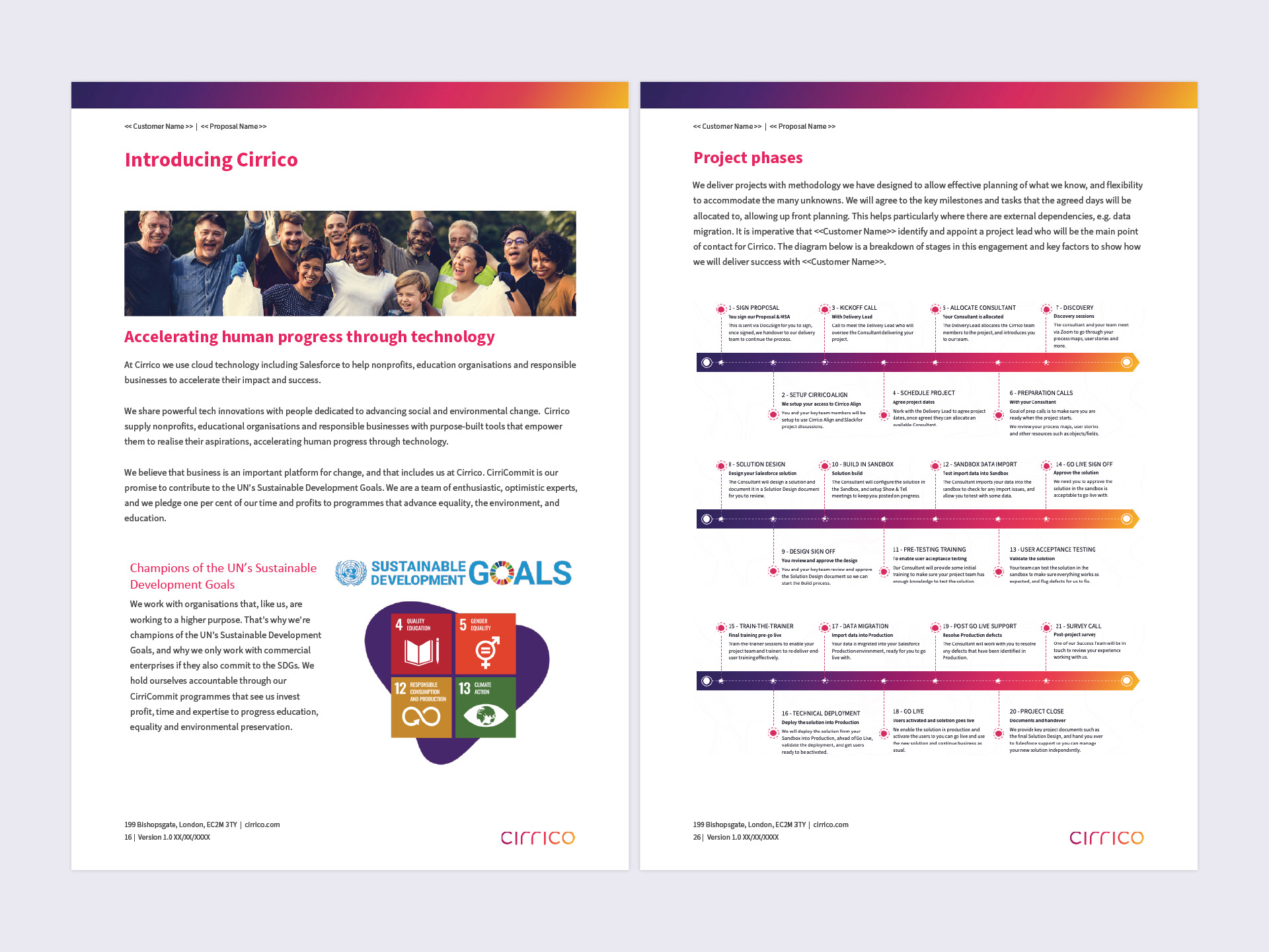
Cirrico is a cloud technology company that has aligned profit with purpose to help non-profits, education organisations and responsible businesses accelerate their impact and success. In 2020 they approached Laws of Attraction, where I was working as Creative Director, to redefine their vision, mission and values, with a view to creating a refreshed brand identity and website that better reflected this new positioning strategy.
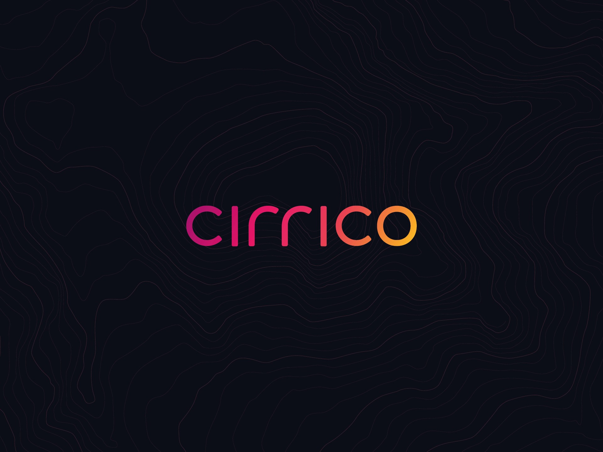
The text-only logo design is quietly confident, carefully considered and deliberately unfussy. All of the letters are lowercase, shunning formality for personality, and giving each letter equal billing. The soft curves and gently rounded corners of the individual letters convey warmth and approachability, but together they convey strength and unity.
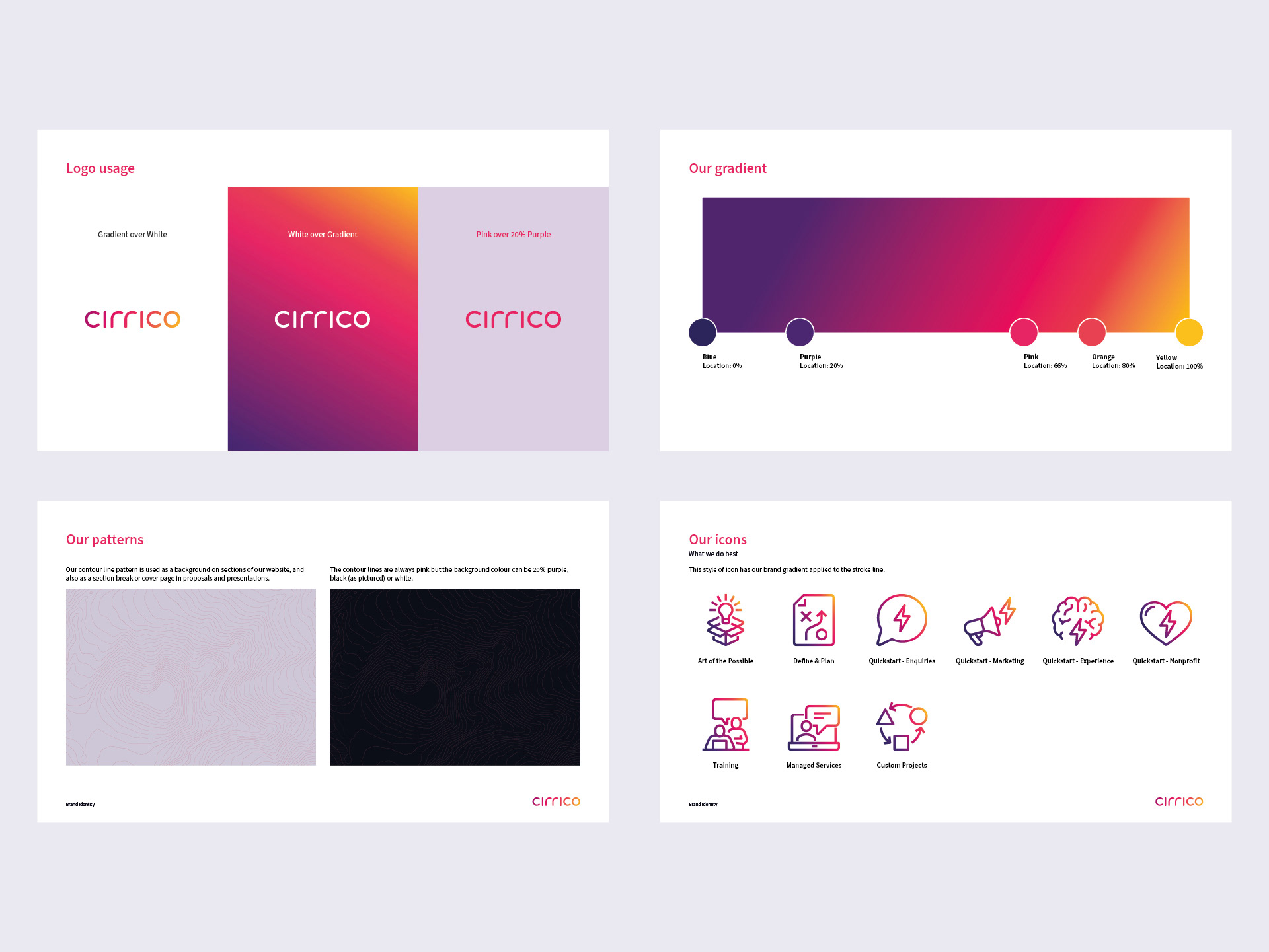
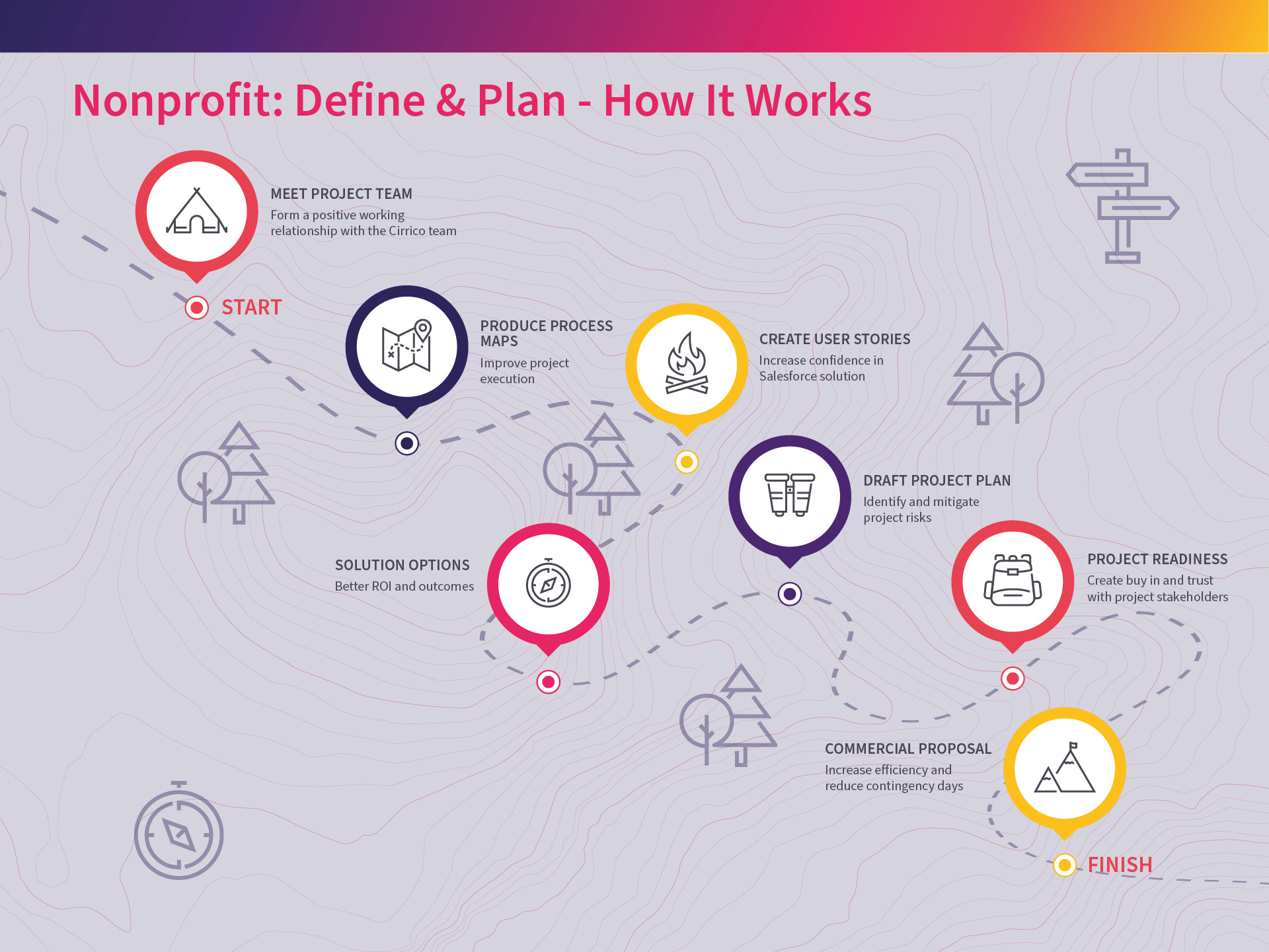
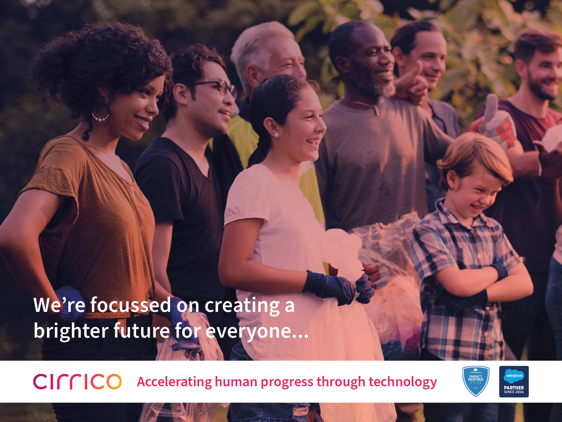
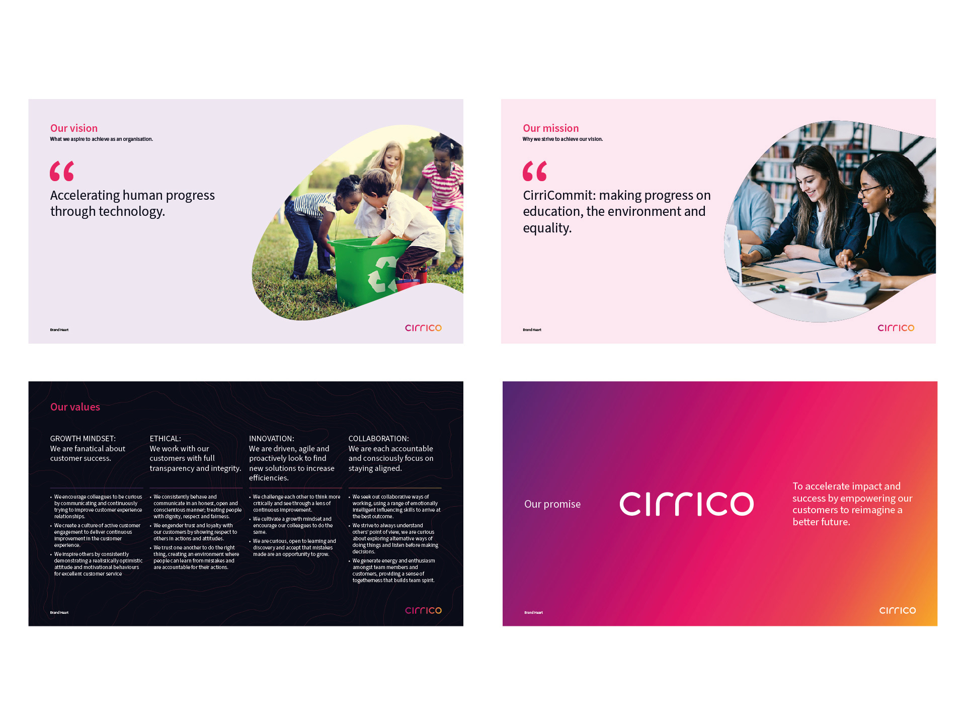
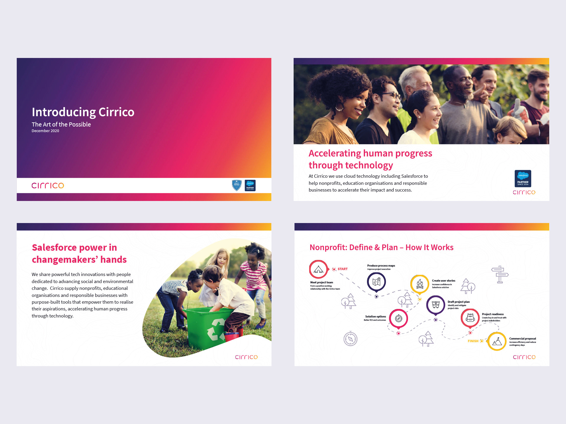
Five vibrant colours were chosen to recall the warmth and energy of Cirrico’s people, and using them in a blended gradient reflects their values of diversity and collaboration. The contour line backgrounds that are used in web and print are a subtle reminder that Cirrico take their clients on a journey, guiding them on their path to success.
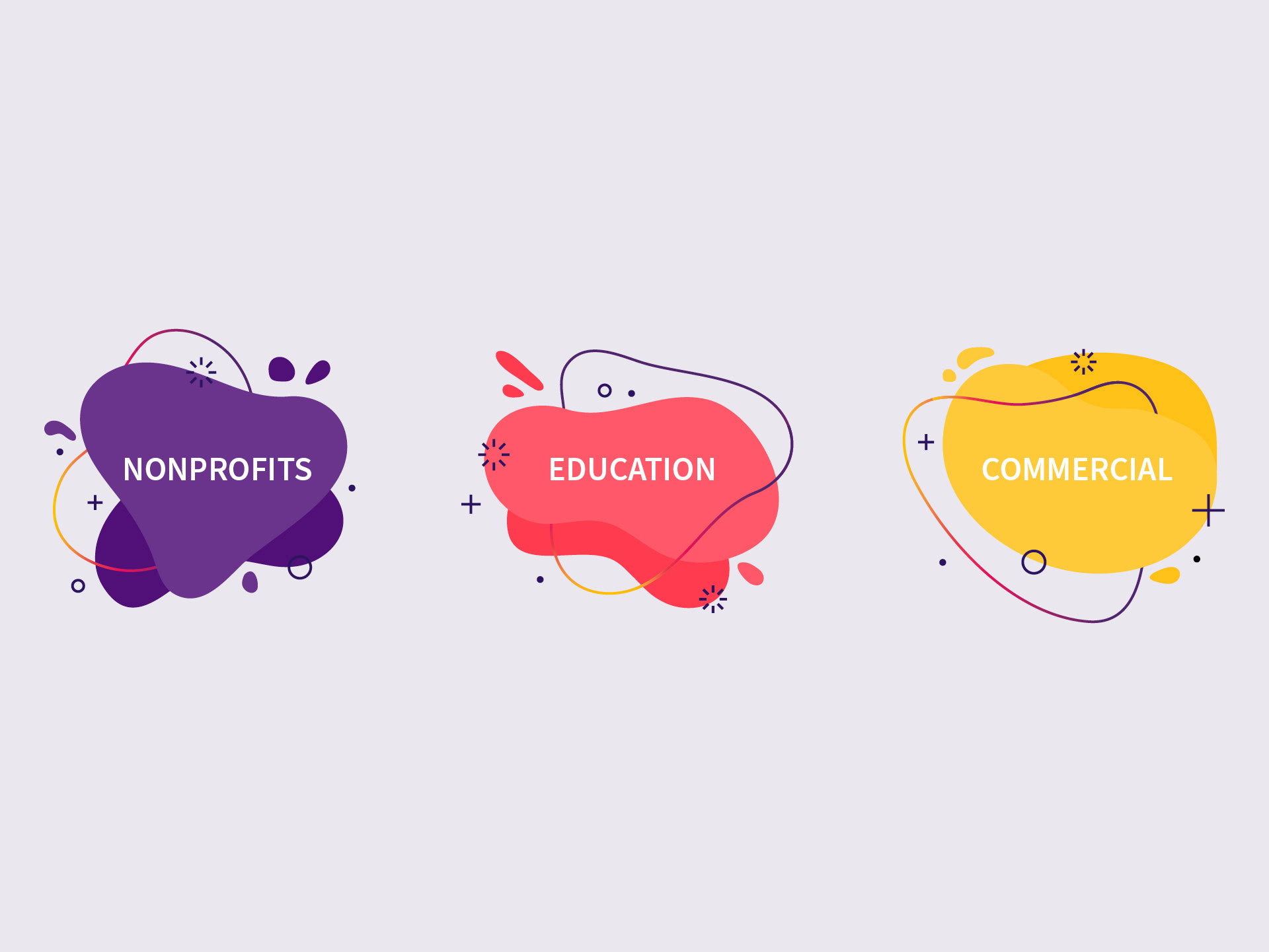
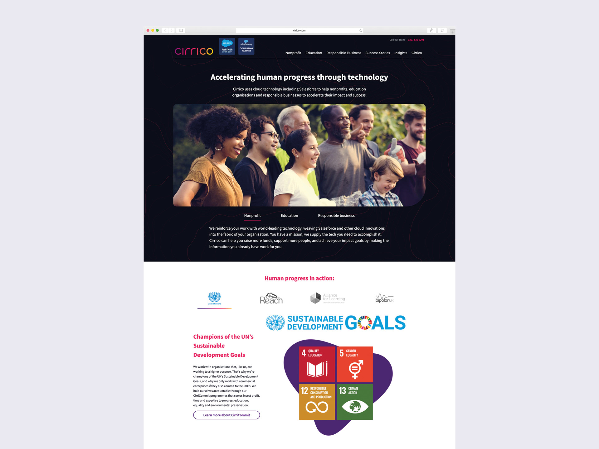
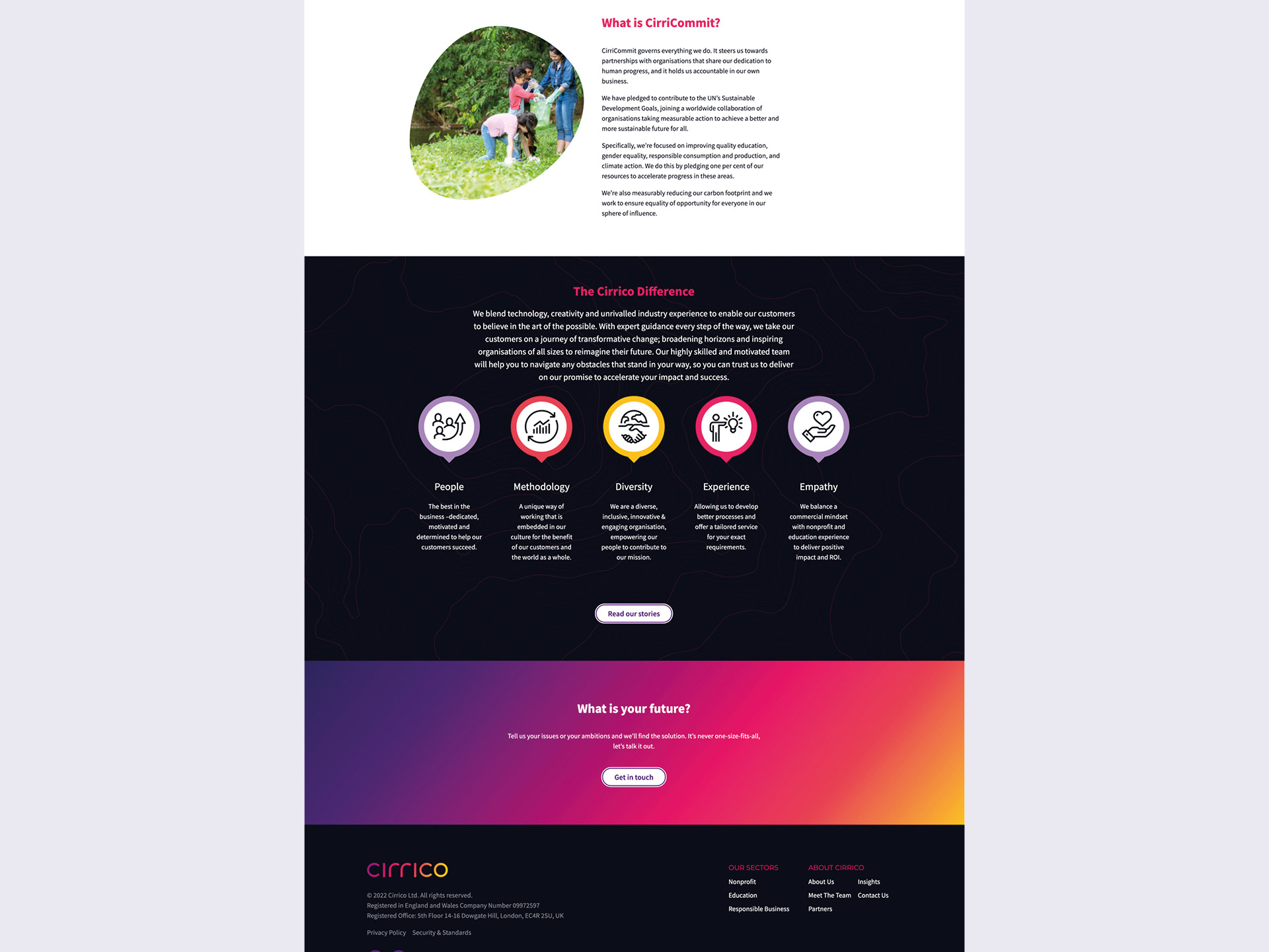
The new website was designed to make the user journey as simple and intuitive as possible by immediately signposting the different audience groups Cirrico work with to the content most appropriate to them.
“Shout out to the incredible team over at Laws of Attraction for taking us on the most amazing journey of transformation and realignment. Special shout out to Simon Kevan, Graham Forbes and James Brook. Thank you!”
Grace Lee
Account Executive at Cirrico
Account Executive at Cirrico