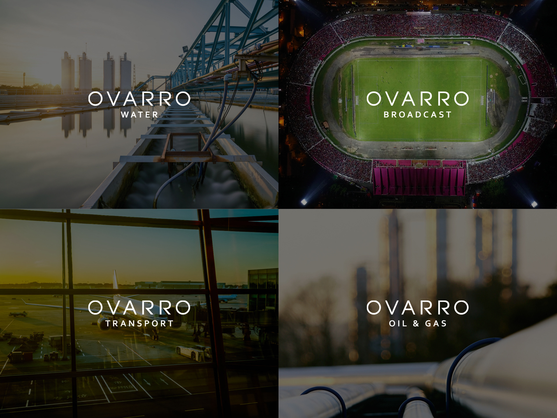
Through innovation and collaboration, Ovarro help clients and their partner network safely, securely and intelligently manage assets across critical and national infrastructure around the globe with industry-leading, data-driven solutions that enable businesses to work smarter and more effectively. My job was to help unite two established companies under a new brand name and visual identity that would resonate with their core audiences and support the company’s overall growth strategy in the years ahead.
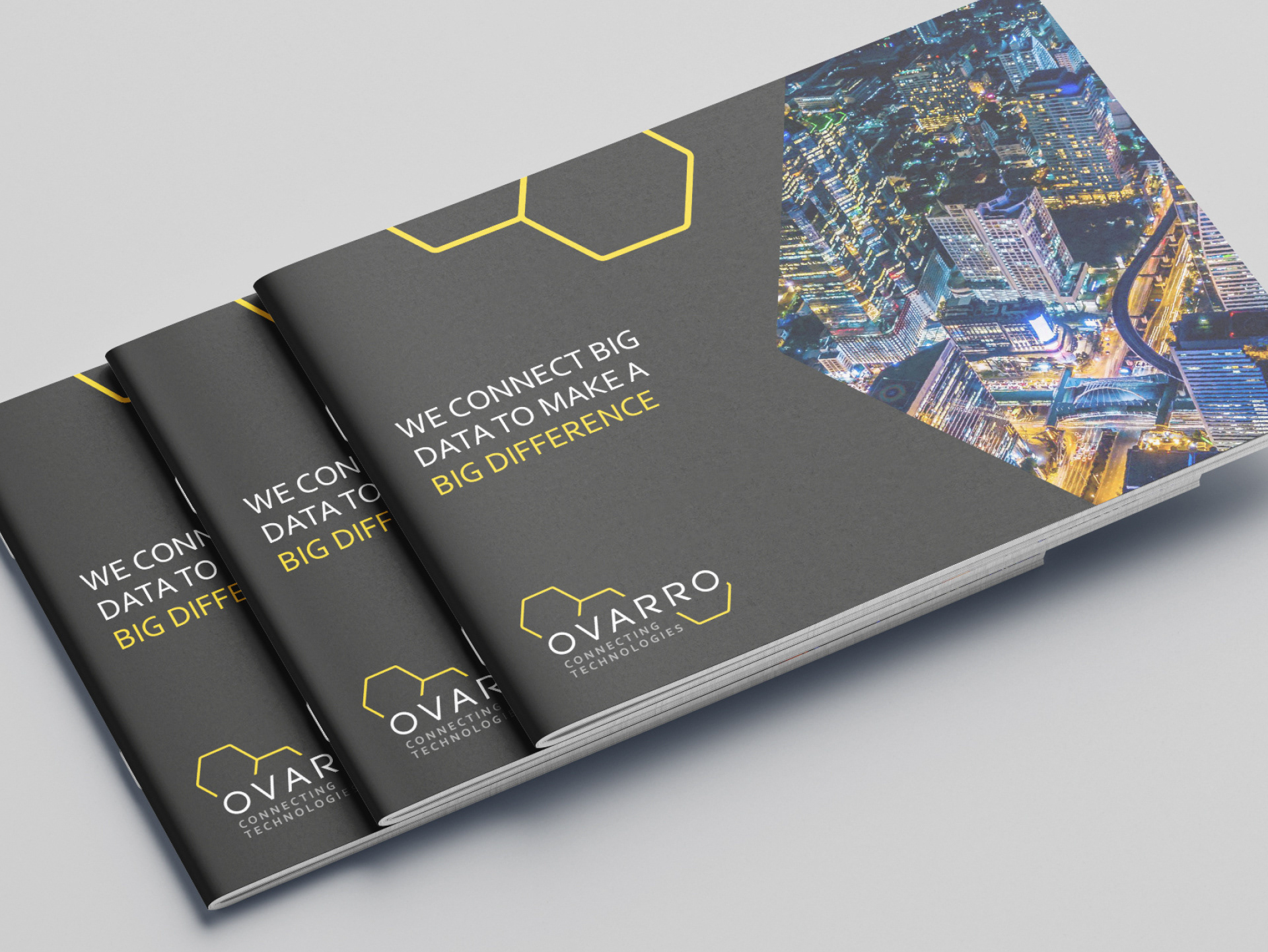
The name, Ovarro, comes from a Roman named Marcus Terentius Varro who, in 36 BC, presented his ‘honeycomb conjecture’ stating that a regular hexagonal grid or honeycomb is the best way to divide a surface into regions of equal area with the least total perimeter. His conjecture was finally proven by mathematician Thomas C. Hales in 1999 and so confirmed the honeycomb as not just a symbol of engineering ingenuity, but of exceptional efficiency and collaboration.
The O at the start was added to make the name look, feel and sound softer and more balanced. In semiotics, circles often represent the Earth, and in the context of the business it symbolises the global solutions that Ovarro offers – connecting technologies that advance productivity, safety and environmental performance.
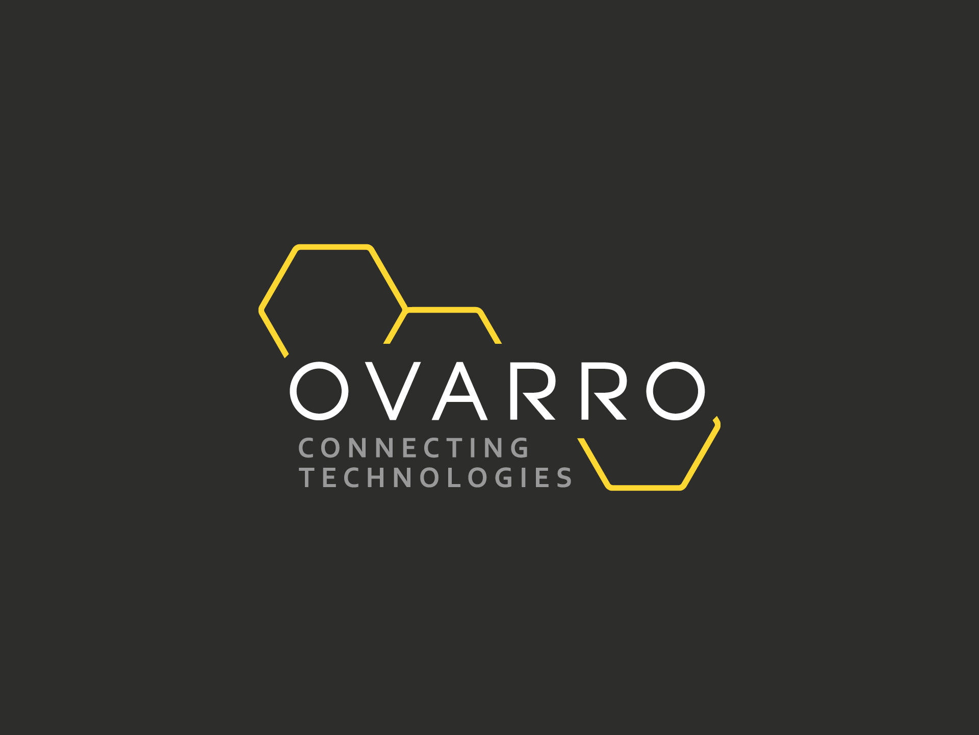
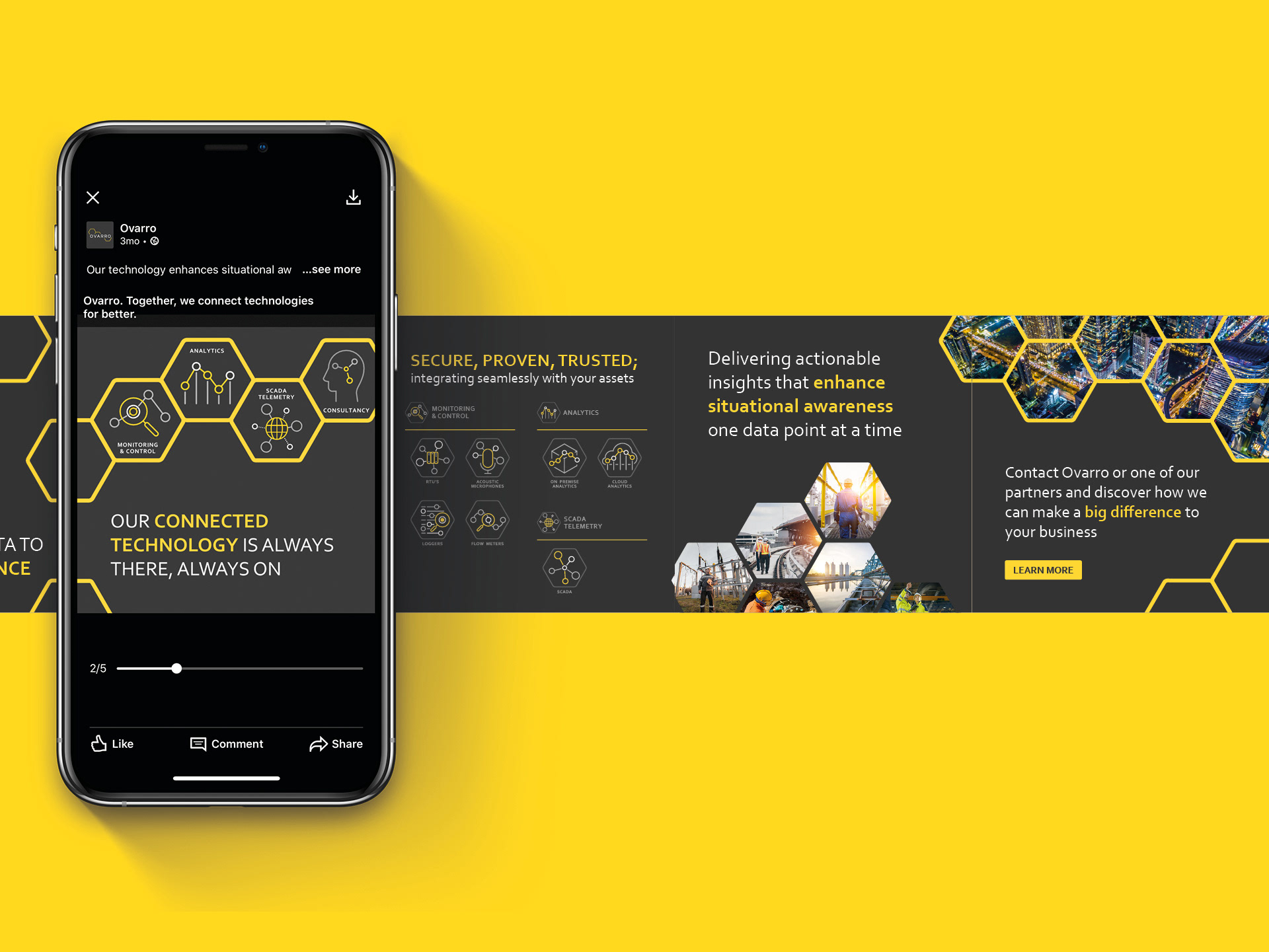
The new strapline ‘Connecting Technologies’ is the thread that ties everything together. The choice of ‘connecting’ as a doing word was very deliberate because the solutions Ovarro provides are extraordinarily proactive – helping to advance productivity, safety and security.
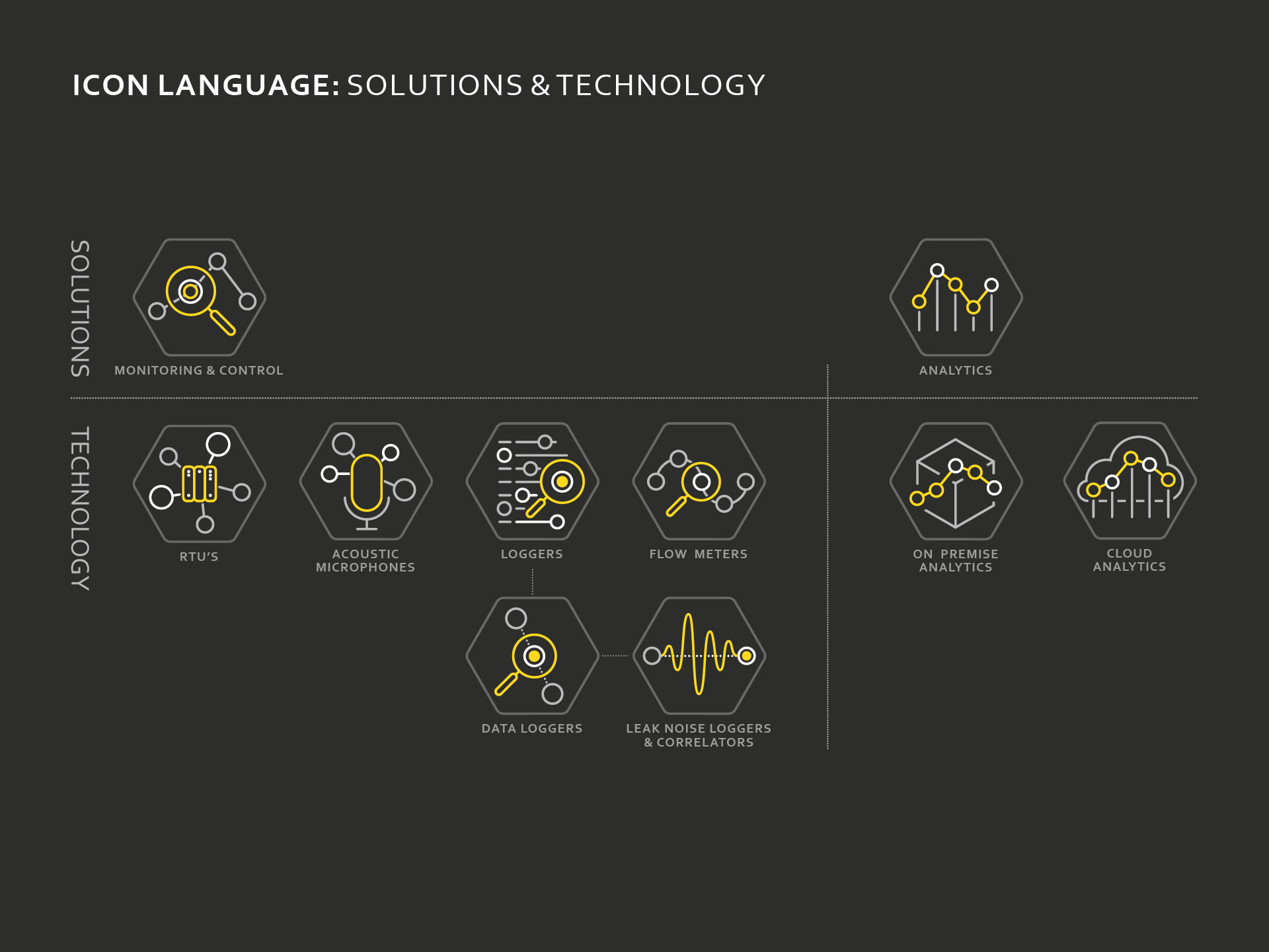
The honeycomb pattern that is used in the brand identity and across the suite of assets and communications is the visual metaphor for these connections – a symbol of the strength and efficiency of collaborative working, and the synergy of people and technology to deliver exceptional solutions.
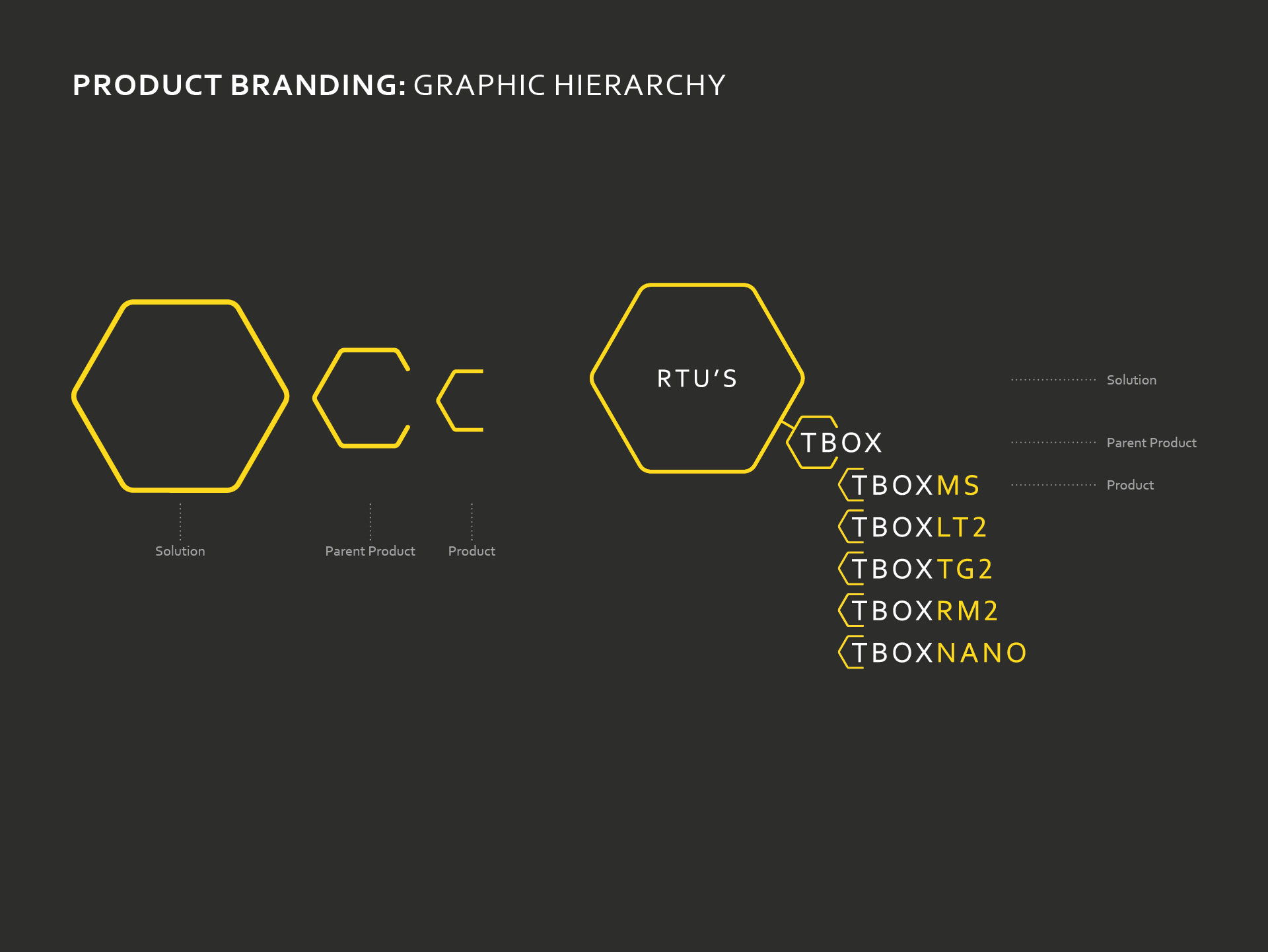
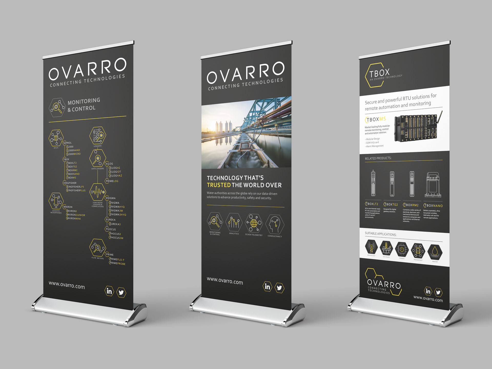
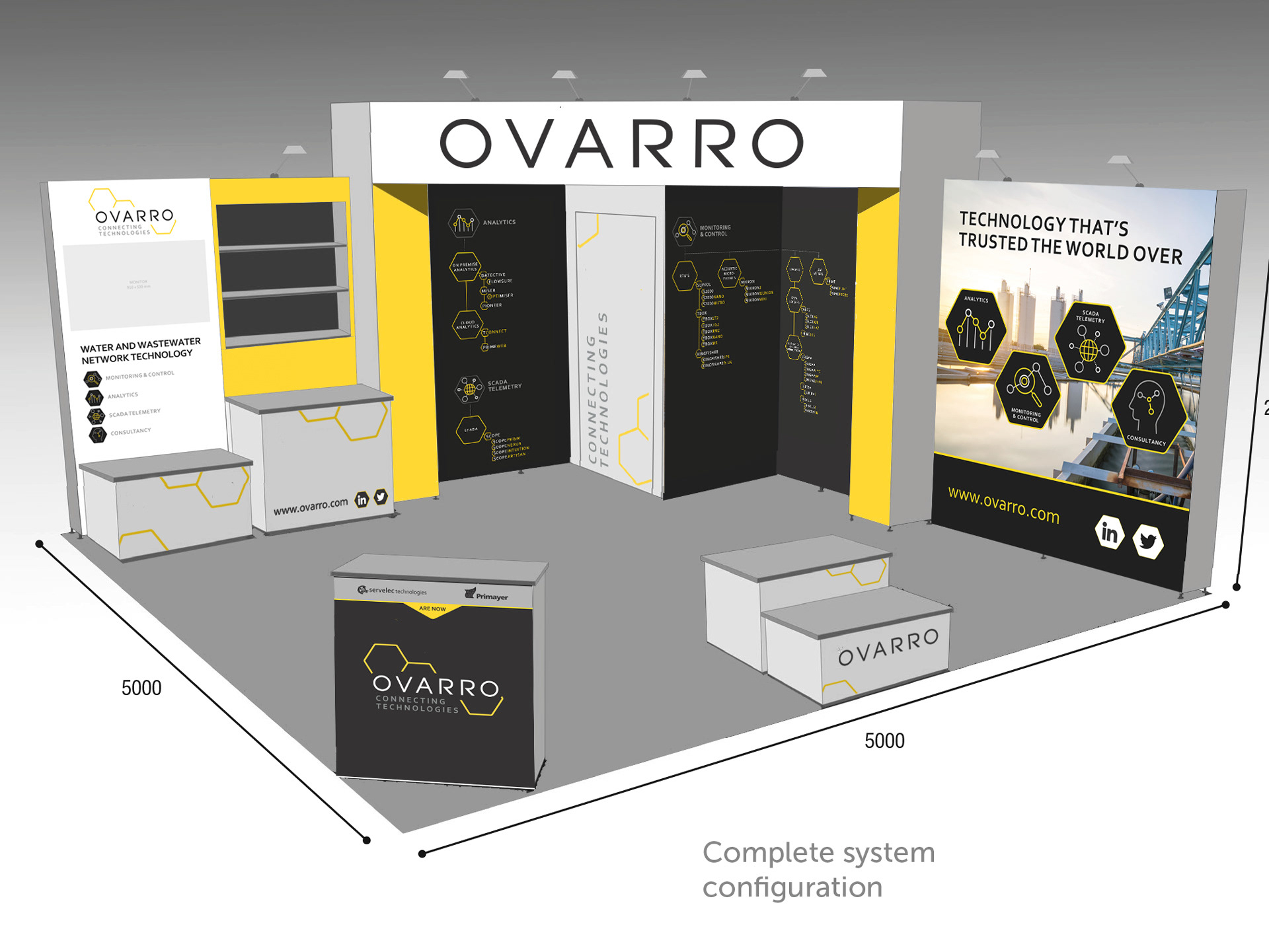
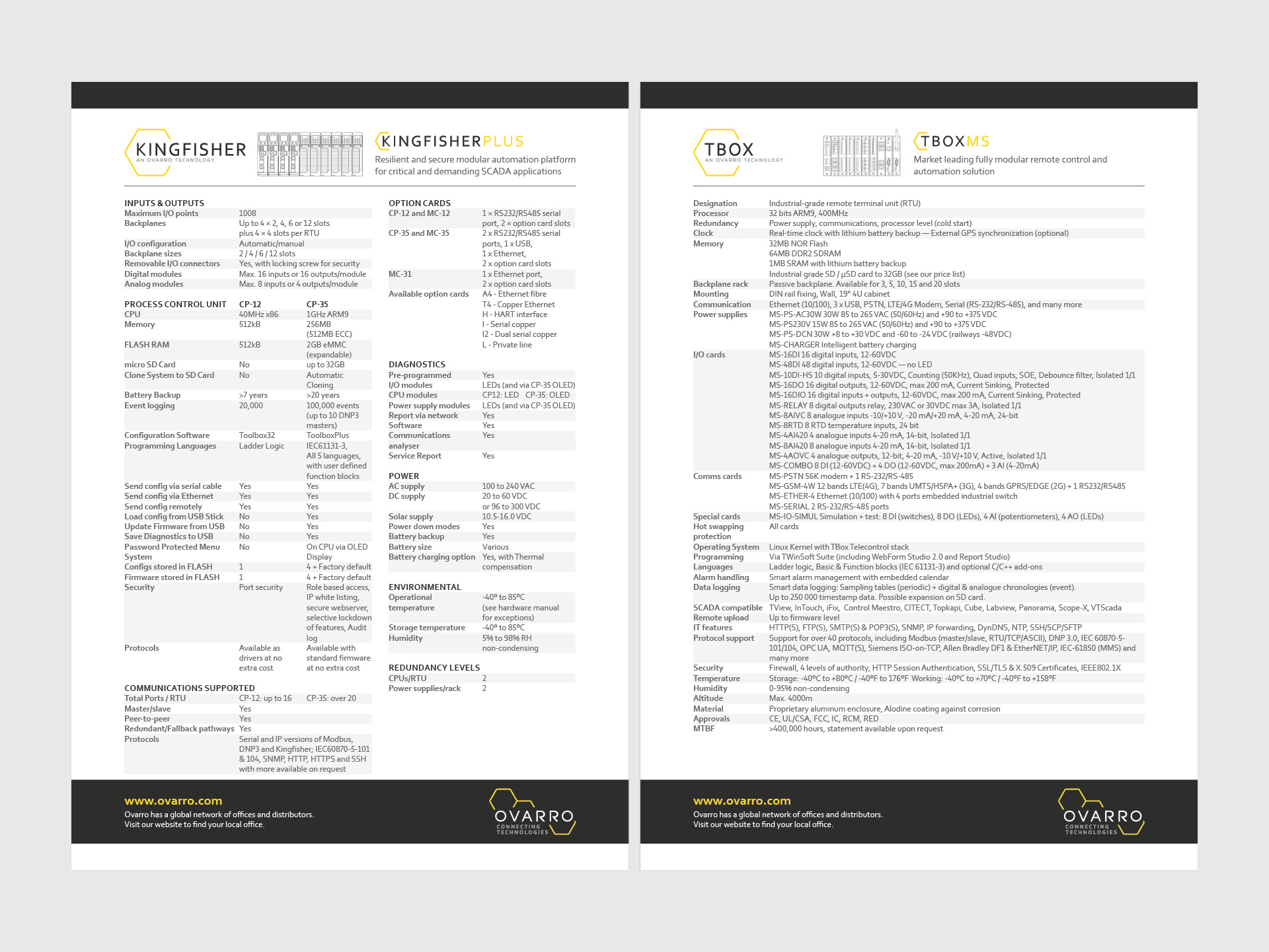
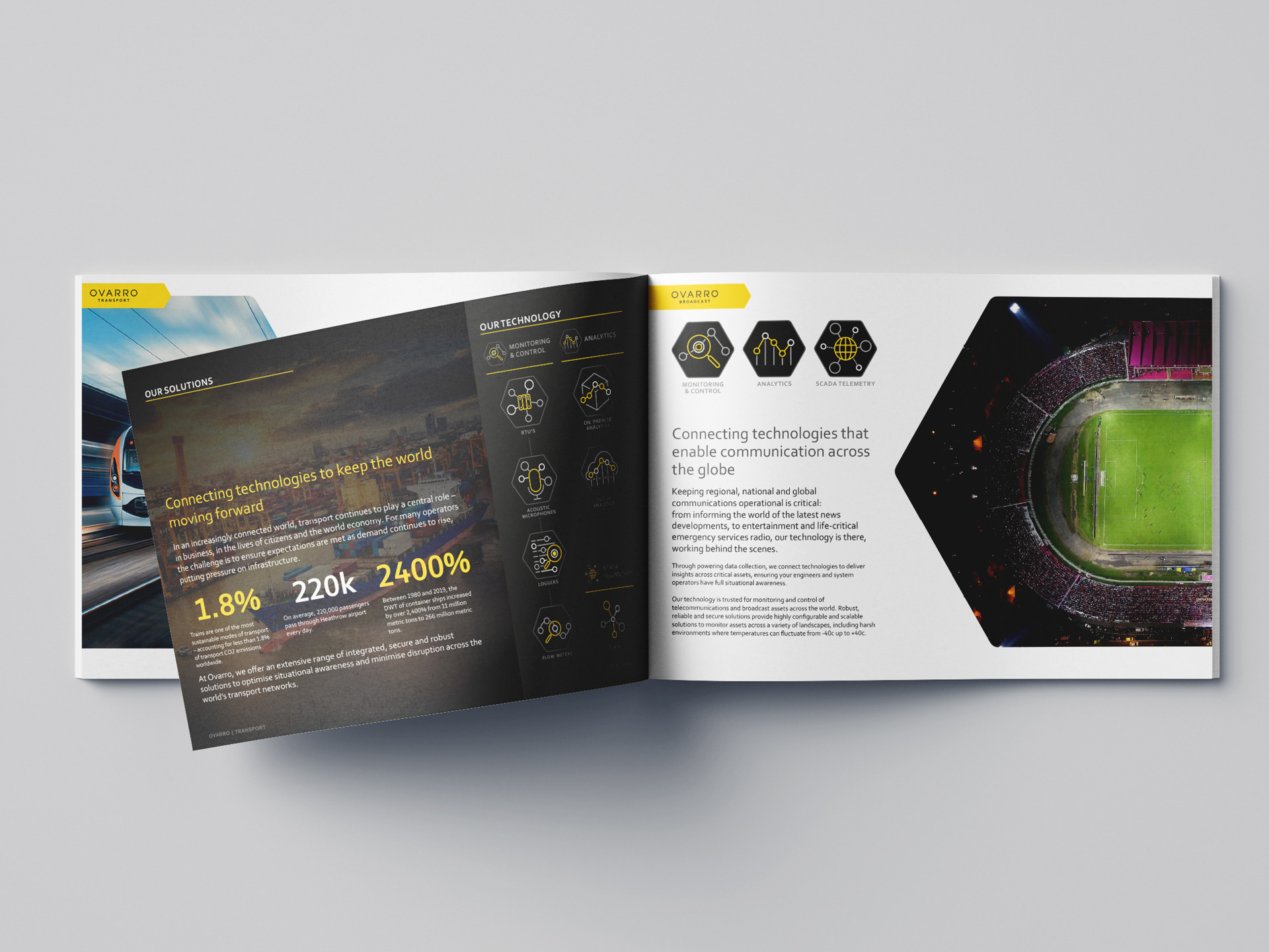
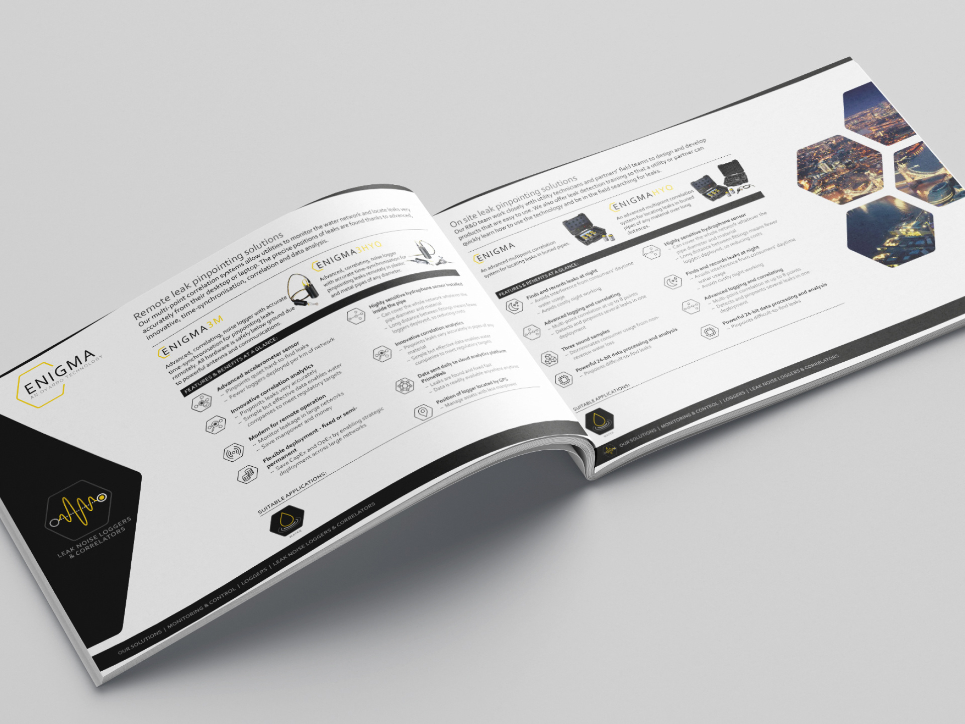
Aligning around 30 product lines from two distinct companies in a unified architecture was one of the biggest design challenges I faced during this project. The resulting product architecture ensured individual products were quickly and easily identifiable by using a simple yet elegant visual hierarchy to denote product and solution categories.
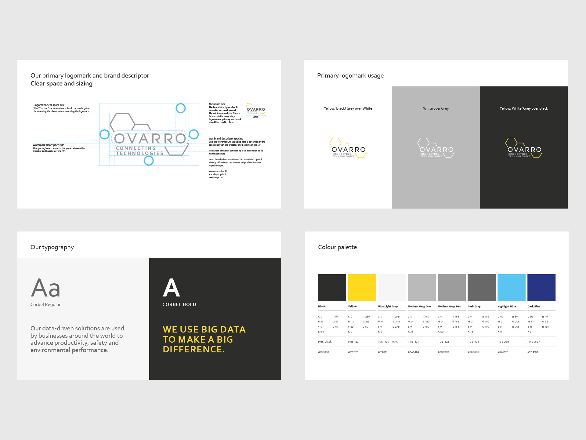
The creation of an extensive brand guide outlined the framework of the new brand personality and provided guidance on how the brand should speak, look and behave across all channels and in a variety of media including social media, print and exhibition collateral.
“I’ve been very impressed with Graham’s ability to work under pressure, on a complex project, and still consistently deliver high-quality creative. He has been steadfast and diligent at every step of the process; from the initial discovery phase to researching and concepting our new name, and of course the delivery and roll-out. We’ve all enjoyed working closely with him throughout.”
David Frost
CEO of Ovarro
CEO of Ovarro